Commit to the bit – differentiate and cuddle the rewards.
A brand that elevates pet grooming essentials to spa-like pampering, while converting D2C shoppers (and their furry best friends)
Project Services
- Strategy
- Branding
- Packaging
- Art Direction
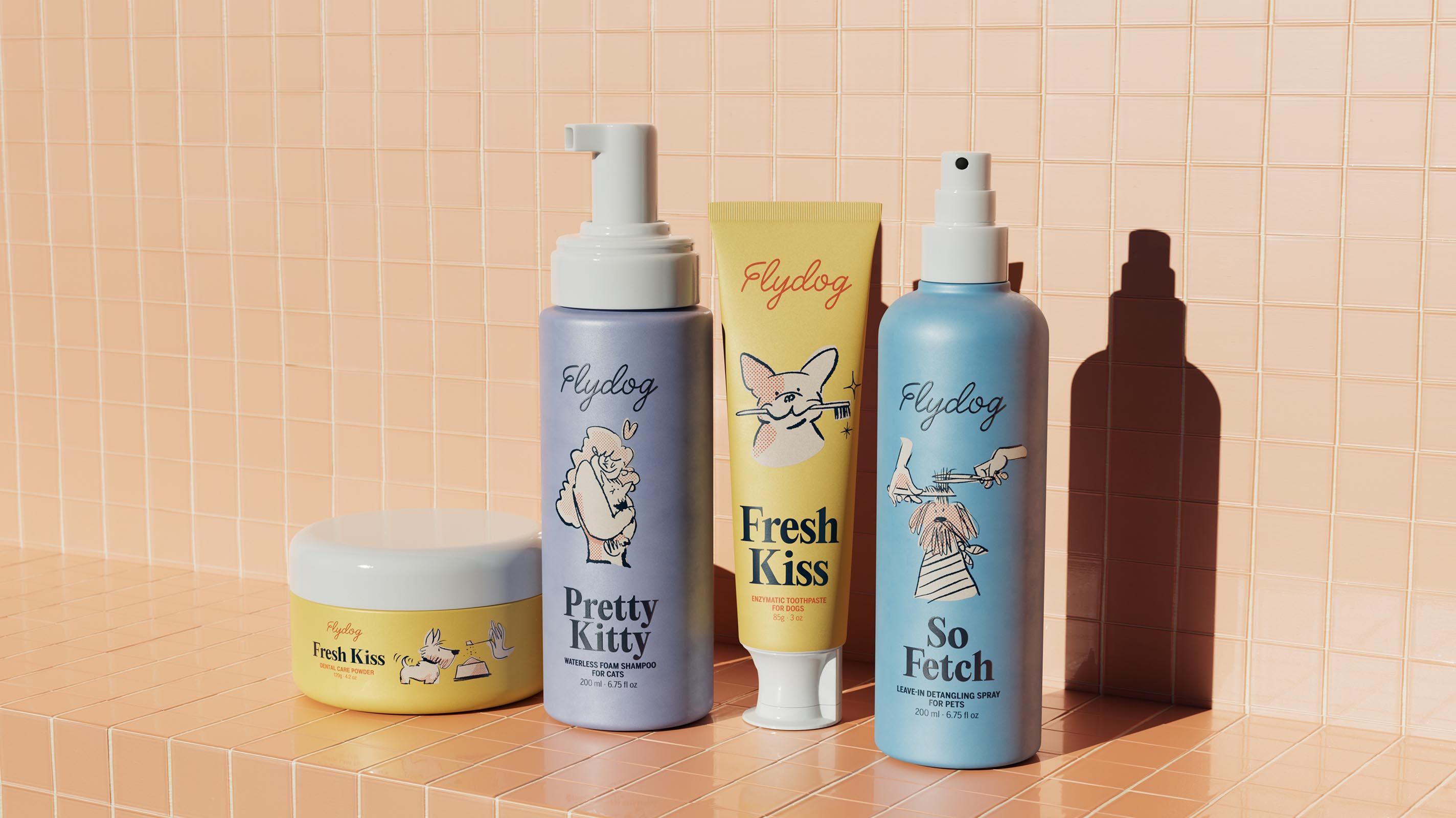
Flydog
- atipo
- Bento
- Siobhan Dempsey
- Renderfolk
It’s no secret people treat their dogs and cats like children, expressing love for those four-legged roommates through the touchpoints of everyday life. And yet, the pet grooming space has been rife with products that are hardly joyful – many are stress-inducing for animals and humans, just plain blah, or both.
Operating as a young startup committed to differentiation, entrepreneur Caroline Fu wanted to shake up the status quo. So she asked Otherness to help realize her vision for Flydog: a better way to care for humankind’s best friend (her stinky Golden Retriever included).
The project’s objective was to create a strong D2C brand that would prove cohesive and conversion-ready on ecommerce sites, including pet industry-specific retailers, such as Chewy. It needed to launch with confidence in a premium-priced category appealing to millennial consumers while also ambitiously driving category innovation.
A brand that makes it easy to be good
The brand identity we developed for Flydog hinges on clear-eyed positioning: pet grooming products should make it easier for people to be the good, ever-doting guardians they want to be.
As a repeat customer of the studio, this entrepreneur knew she could lean on us to conduct research wide and deep, particularly into a discerning North American audience. And we discovered: the category disruption didn’t have to arrive in a big bang.
Flydog came to express itself as a daisy chain of small, pet-centric innovations designed in celebration of interspecies relationships and the belief that every dimension of domesticity deserves elevation.
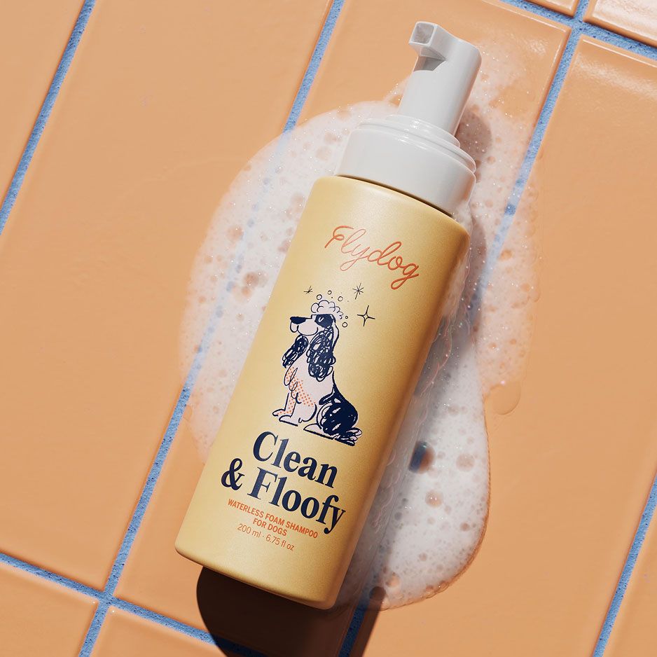
For the enjoyment of their ultimate end users, the product formulations consist of pure ingredients that smell, taste, and feel good. Think: chicken and peanut butter flavours and no-rinse-necessary foams.
And for their humans, we leveraged our years of design experience in the boutique skincare space as well as living with our own in-house mixed-breed pup. The bottle pumps themselves had to be ergonomic – compressible with that one free hand. Line extensibility was also crucial because the brand needed to grow with integrity across items.
Impact within 6 months of launch
Featured in the "Best New Product" showcase at SuperZoo, North America's #1 Pet Supply trade show
4.5 Star rating on Amazon
A partnership with Chewy
Ongoing talks with major US retailers
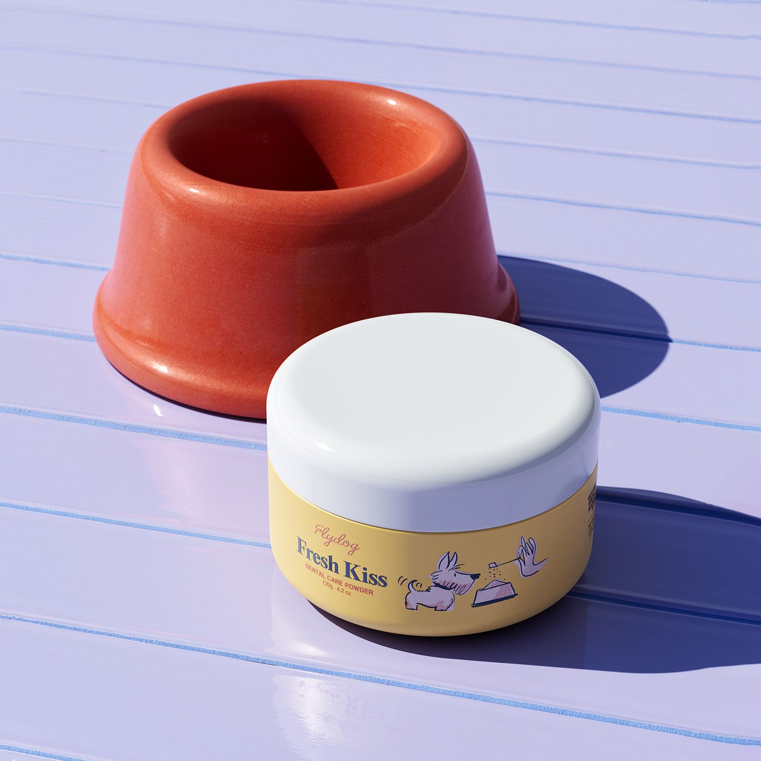
A look and feel that’s playful yet durable
Everything about the Flydog brand system conveys spa day-level sophistication with a twist of furball fun.
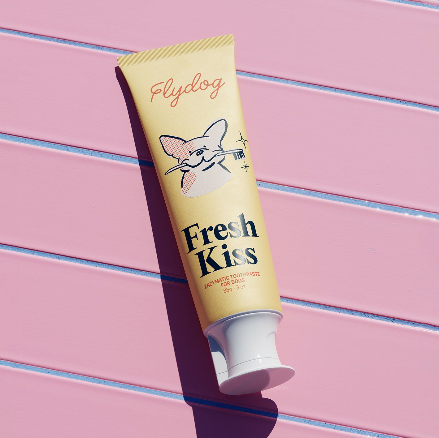
We designed the logo to be dynamic and playful – its F a gentle nod to puppy ears – while simultaneously durable enough to pop in all mediums. The script typeface is loopy and bouncy and is easy to recognize on packaging.
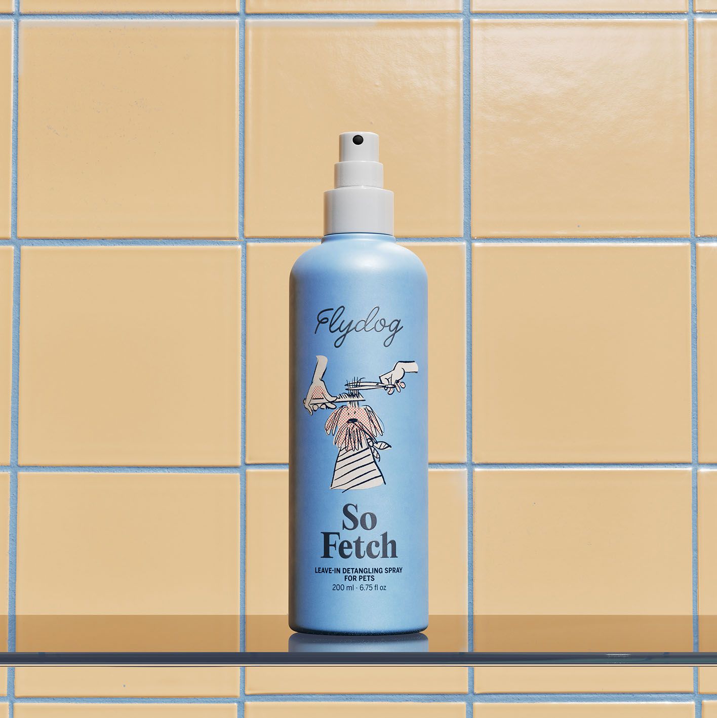
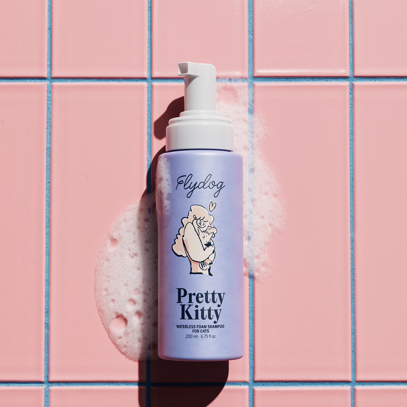
An airy, clean millennial look inspired our colour palette, intending to instill trust and affirm premium taste. The basis is a neutral soft peach, signalling that this brand is a purveyor of daily essentials. On top, however, a mix-and-matchable range of cheerful colours makes the products pretty enough to perch on a bathtub ledge or worthy of a shelfie à la skincare social media.
"Otherness understood immediately what we were after with Flydog. The premium look and feel of the brand has helped us sign big deals with new sales channels way faster than we expected. We already look like big players who understand our audience, not like a small startup still learning.
Caroline Fu, Founder of Flydog

Cost-effective depth – and fun
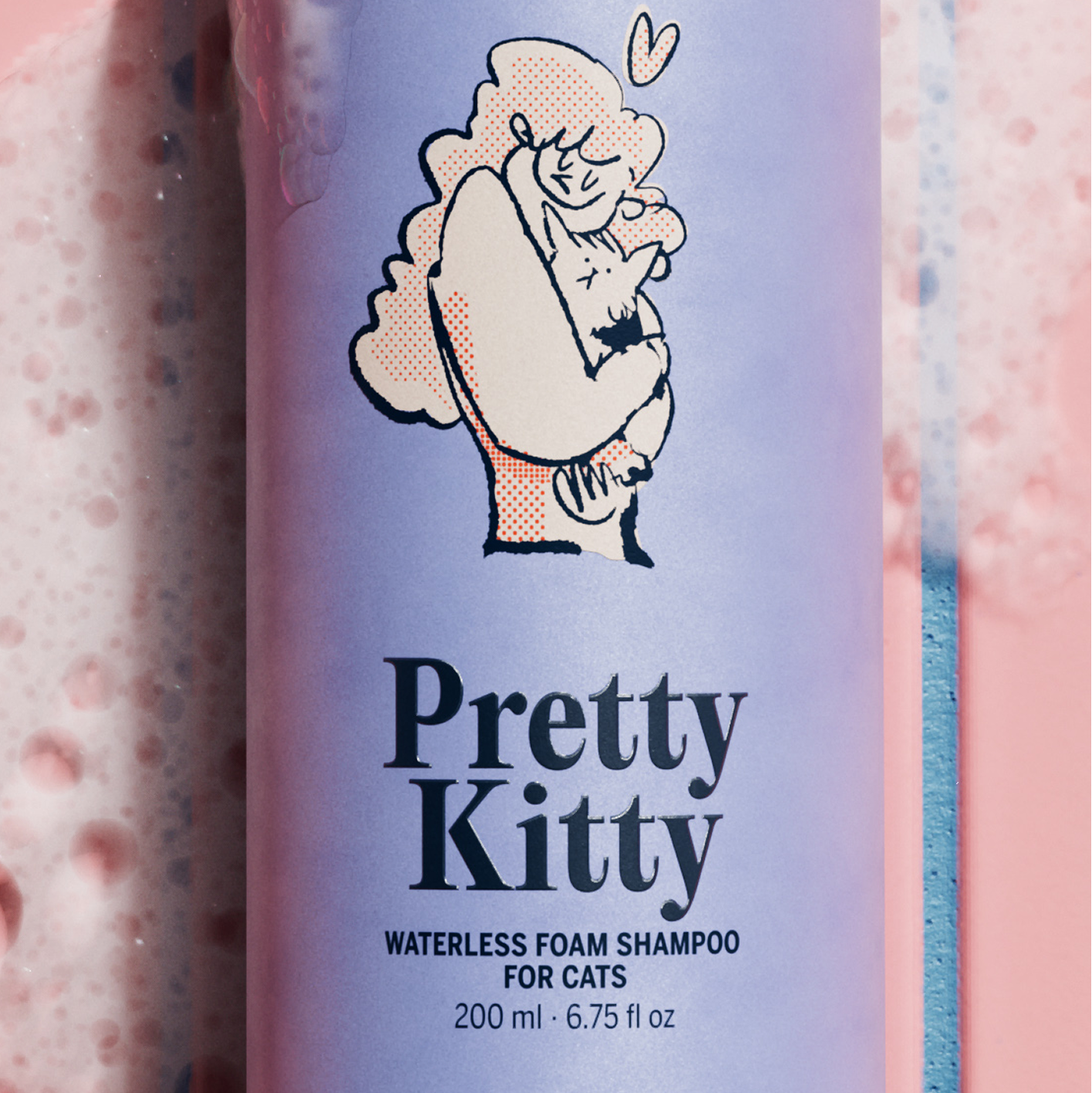
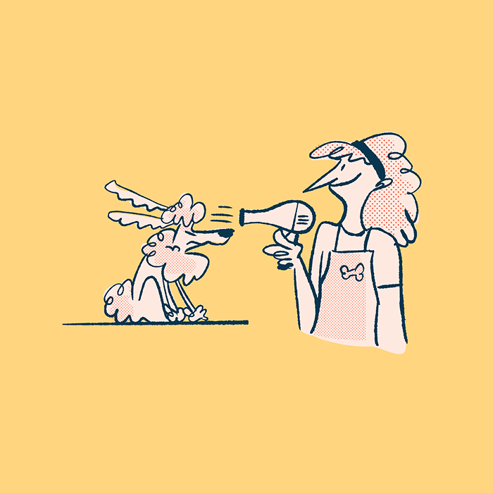
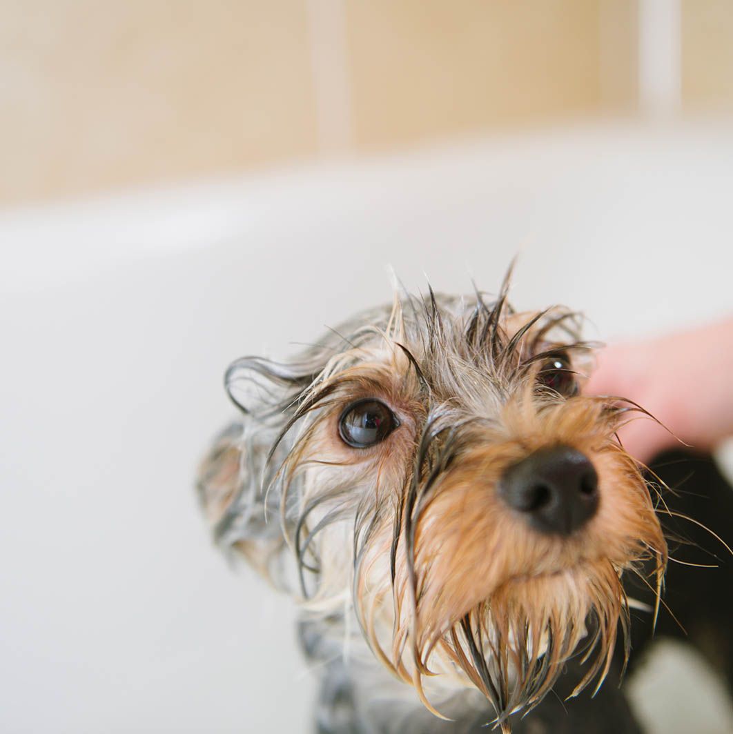
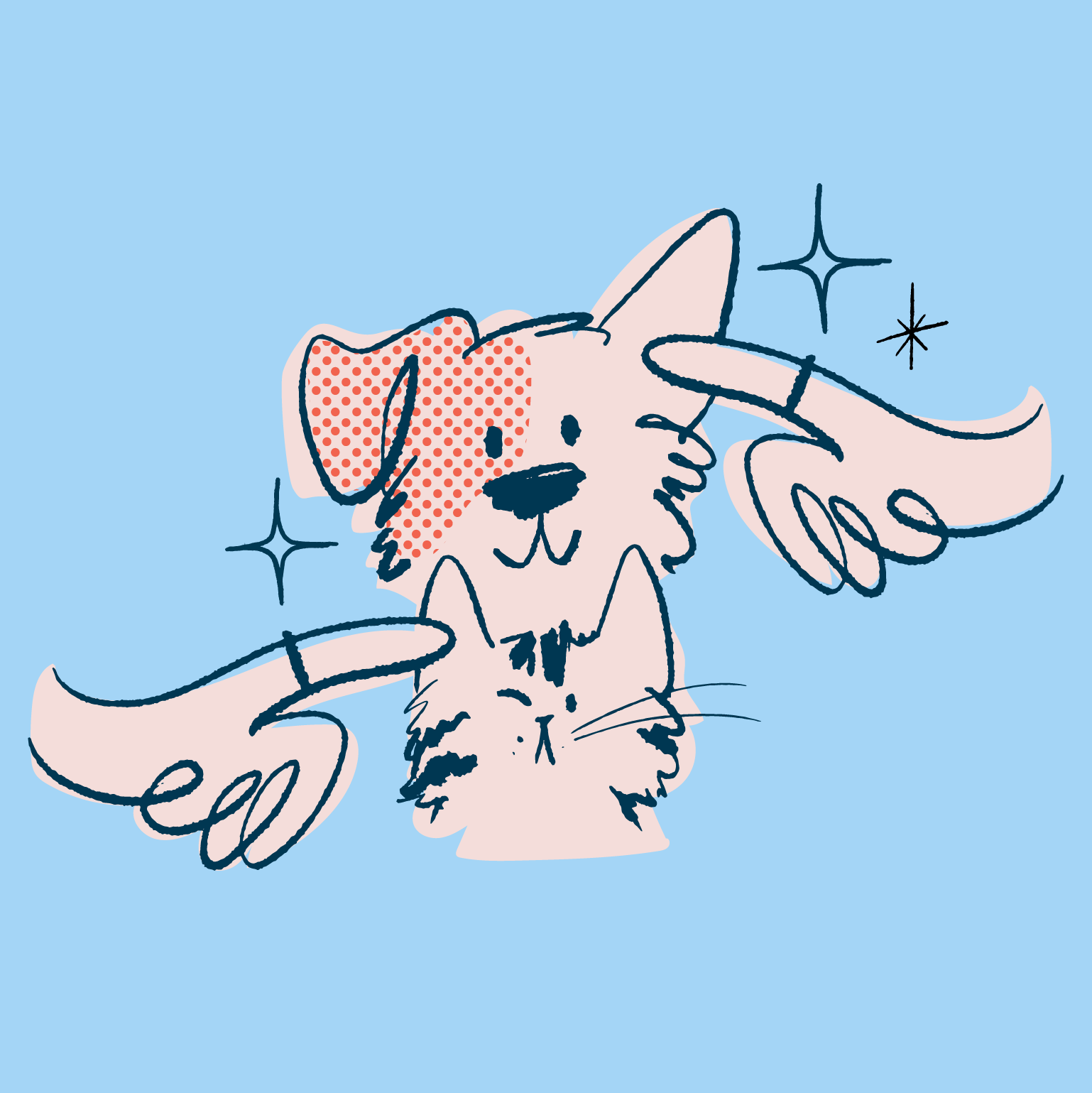
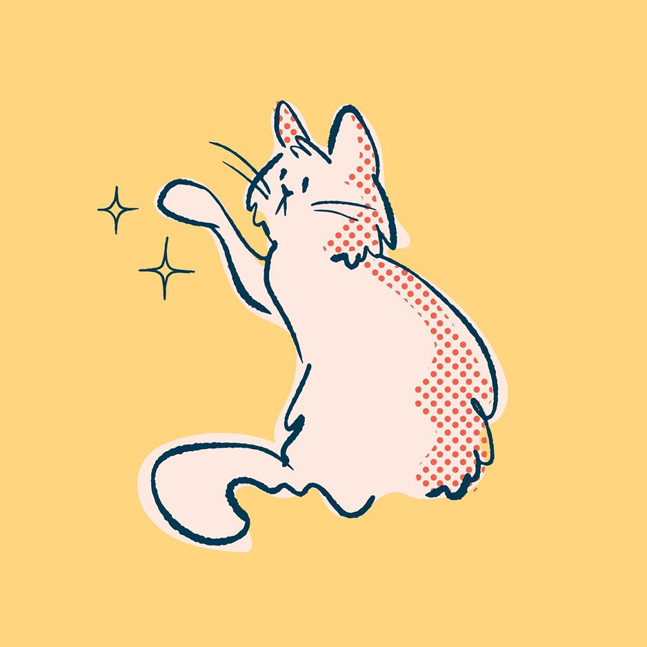
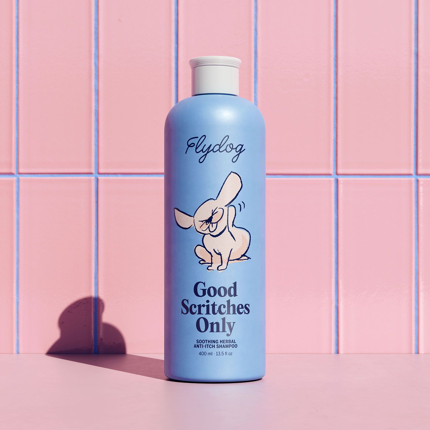
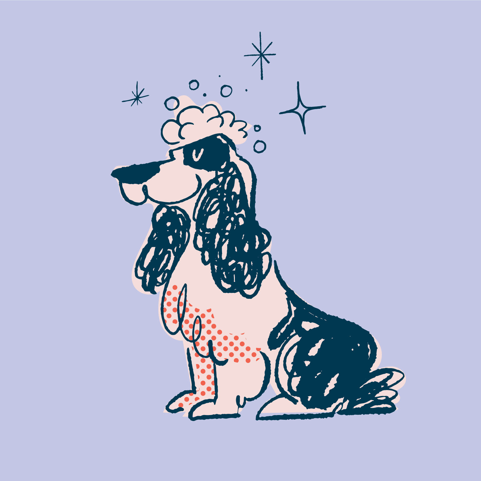
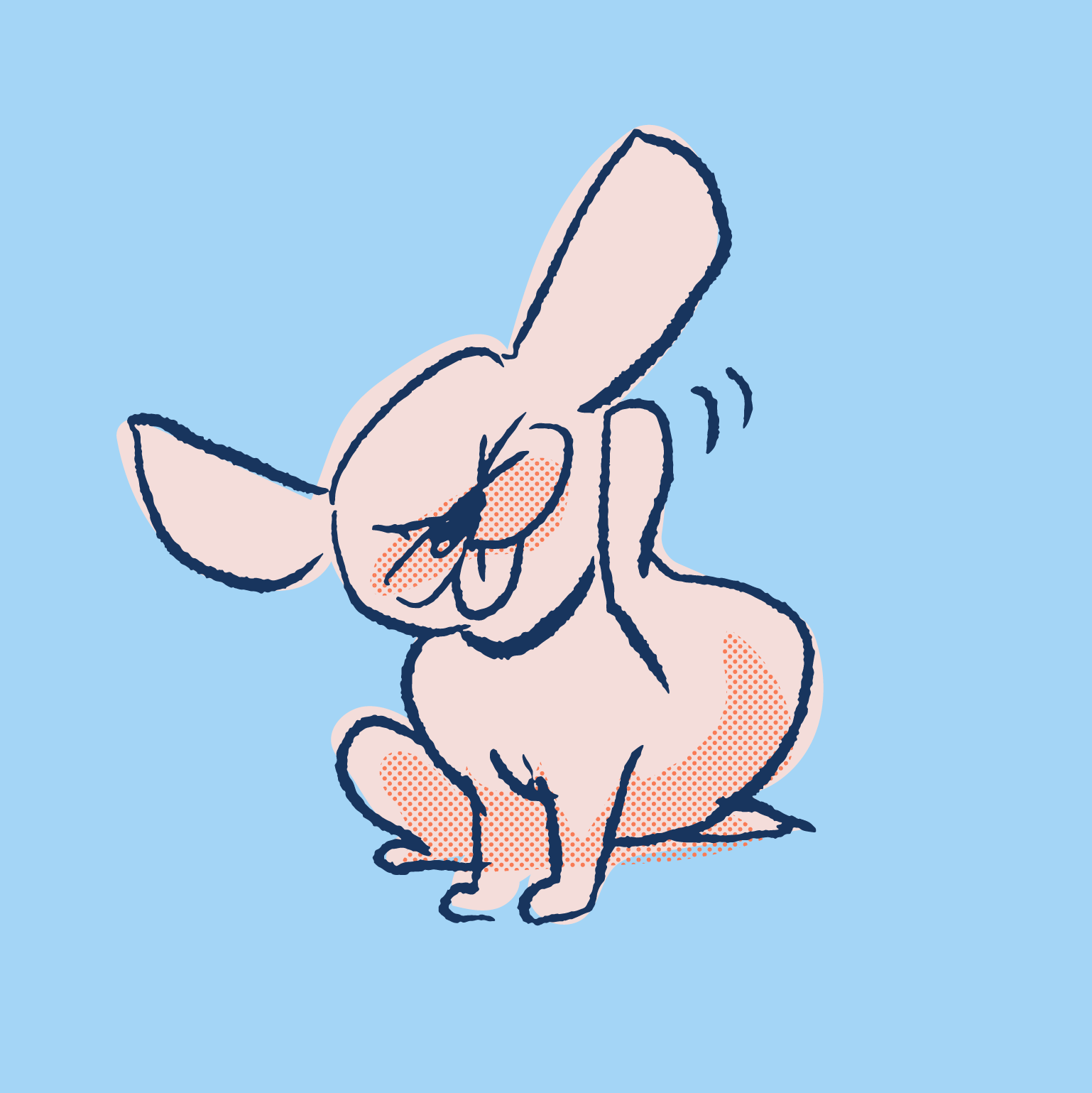
While the Flydog world naturally incorporates photos – of evenly lit, soothing moments that bond pet and petter – illustrations are the hero of our story. In an oozingly expressive way, the images capture the body language of dogs and cats and those hilariously unapologetic expressions that their humans know too well. Their graphics have a vintage comic book feel, with rough line work and halftone patterns that add depth and density without adding cost to production.
For the brand’s naming system, we created product names and descriptions that are as fun to say as they are to see. Each has a joke written within, pairing with the illustrations that play off the names to communicate that making this world a more floofy place is within our hands.
